Class: QgsColorButton
A cross platform button subclass for selecting colors. Will open a color chooser dialog when clicked. Offers live updates to button from color chooser dialog. An attached drop-down menu allows for copying and pasting colors, picking colors from the screen, and selecting colors from color swatch grids.
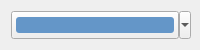
QgsColorButton in a default state
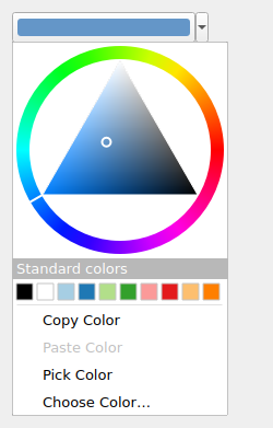
QgsColorButton showing drop down menu
Class Hierarchy
Base classes
- class qgis.gui.QgsColorButton[source]
Bases:
QToolButton- __init__(parent: QWidget | None = None, cdt: str | None = '', registry: QgsColorSchemeRegistry | None = None)
Construct a new color ramp button. Use
parentto attach a parent QWidget to the dialog. Usecdtstring to define the title to show in the color ramp dialog Use a color schemeregistryfor color swatch grids to show in the drop-down menu. If not specified, the button will use the global color scheme registry instead- Parameters:
parent (Optional[QWidget] = None)
cdt (Optional[str] = '')
registry (Optional[QgsColorSchemeRegistry] = None)
- class Behavior
Bases:
int
- ShowDialog = 0
- SignalOnly = 1
- activatePicker(self)[source]
Activates the color picker tool, which allows for sampling a color from anywhere on the screen
- allowOpacity(self) bool[source]
Returns whether opacity modification (transparency) is permitted for the color.
- Return type:
bool
- Returns:
Trueif opacity modification is allowed
See also
- behavior(self) QgsColorButton.Behavior[source]
Returns the behavior for when the button is clicked.
- Return type:
- Returns:
behavior when button is clicked
See also
- signal cleared[source]
pyqtSignal(*types, name: str = …, revision: int = …, arguments: Sequence = …) -> PYQT_SIGNAL
types is normally a sequence of individual types. Each type is either a type object or a string that is the name of a C++ type. Alternatively each type could itself be a sequence of types each describing a different overloaded signal. name is the optional C++ name of the signal. If it is not specified then the name of the class attribute that is bound to the signal is used. revision is the optional revision of the signal that is exported to QML. If it is not specified then 0 is used. arguments is the optional sequence of the names of the signal’s arguments.
- color(self) QColor[source]
Returns the currently selected color.
- Return type:
QColor
- Returns:
currently selected color
See also
- signal colorChanged[source]
pyqtSignal(*types, name: str = …, revision: int = …, arguments: Sequence = …) -> PYQT_SIGNAL
types is normally a sequence of individual types. Each type is either a type object or a string that is the name of a C++ type. Alternatively each type could itself be a sequence of types each describing a different overloaded signal. name is the optional C++ name of the signal. If it is not specified then the name of the class attribute that is bound to the signal is used. revision is the optional revision of the signal that is exported to QML. If it is not specified then 0 is used. arguments is the optional sequence of the names of the signal’s arguments.
- signal colorClicked[source]
pyqtSignal(*types, name: str = …, revision: int = …, arguments: Sequence = …) -> PYQT_SIGNAL
types is normally a sequence of individual types. Each type is either a type object or a string that is the name of a C++ type. Alternatively each type could itself be a sequence of types each describing a different overloaded signal. name is the optional C++ name of the signal. If it is not specified then the name of the class attribute that is bound to the signal is used. revision is the optional revision of the signal that is exported to QML. If it is not specified then 0 is used. arguments is the optional sequence of the names of the signal’s arguments.
- colorDialogTitle(self) str[source]
Returns the title for the color chooser dialog window.
- Return type:
str
- Returns:
title for the color chooser dialog
See also
- colorSchemeRegistry(self) QgsColorSchemeRegistry | None[source]
Returns the color scheme registry for the button, which controls the color swatch grids that are shown in the button’s drop-down menu.
- Return type:
Optional[QgsColorSchemeRegistry]
- Returns:
color scheme registry for the button. If returned value is 0 then all color swatch grids are hidden from the button’s drop-down menu.
See also
- context(self) str[source]
Returns the context string for the color button. The context string is passed to all color swatch grids shown in the button’s drop-down menu, to allow them to customize their display colors based on the context.
- Return type:
str
- Returns:
context string for the color button’s color swatch grids
See also
- static createMenuIcon(color: QColor | Qt.GlobalColor, showChecks: bool = True) QPixmap[source]
Creates an icon for displaying a
colorin a drop-down menu.If
showChecksset toTrue, then a checkboard pattern will be shown behind semi-transparent colors.Added in version 3.6.
- Parameters:
color (Union[QColor, Qt.GlobalColor])
showChecks (bool = True)
- Return type:
QPixmap
- defaultColor(self) QColor[source]
Returns the default color for the button, which is shown in the button’s drop-down menu for the “default color” option.
- Return type:
QColor
- Returns:
default color for the button. Returns an invalid QColor if the default color option is disabled.
See also
- dragEnterEvent(self, e: QDragEnterEvent | None)[source]
Reimplemented to accept dragged colors
- Parameters:
e (Optional[QDragEnterEvent])
- dragLeaveEvent(self, e: QDragLeaveEvent | None)[source]
Reimplemented to reset button appearance after drag leave
- Parameters:
e (Optional[QDragLeaveEvent])
- dropEvent(self, e: QDropEvent | None)[source]
Reimplemented to accept dropped colors
- Parameters:
e (Optional[QDropEvent])
- isNull(self) bool[source]
Returns
Trueif the current color is null.See also
See also
- Return type:
bool
- keyPressEvent(self, e: QKeyEvent | None)[source]
Reimplemented to allow canceling color pick via keypress, and sample via space bar press
- Parameters:
e (Optional[QKeyEvent])
- linkToProjectColor(self, name: str | None)[source]
Sets the button to link to an existing project color, by color
name.This changes the behavior of the button to a “linked” mode. Specifically, the button will show the linked color and respond to changes in the project color scheme by refreshing the displayed color automatically. Additionally, the button’s menu will show items specific to linked color mode, including an option to “unlink” from the project color.
See also
See also
Added in version 3.6.
- Parameters:
name (Optional[str])
- linkedProjectColorName(self) str[source]
Returns the linked project color name, if set.
See also
Added in version 3.6.
- Return type:
str
- mouseMoveEvent(self, e: QMouseEvent | None)[source]
Reimplemented to allow dragging colors from button
- Parameters:
e (Optional[QMouseEvent])
- mousePressEvent(self, e: QMouseEvent | None)[source]
Reimplemented to detect right mouse button clicks on the color button and allow dragging colors
- Parameters:
e (Optional[QMouseEvent])
- mouseReleaseEvent(self, e: QMouseEvent | None)[source]
Reimplemented to allow color picking
- Parameters:
e (Optional[QMouseEvent])
- noColorString(self) str[source]
Returns the string used for the “no color” option in the button’s drop-down menu.
- Return type:
str
- Returns:
string used for the “no color” menu option
See also
See also
Note
The “no color” option is only shown if the color button is set to show an alpha channel in the color dialog
- pasteColor(self)[source]
Pastes a color from the clipboard to the color button. If clipboard does not contain a valid color or string representation of a color, then no change is applied.
See also
- setAllowOpacity(self, allowOpacity: bool)[source]
Sets whether opacity modification (transparency) is permitted for the color. Defaults to
False.- Parameters:
allowOpacity (bool) – set to
Trueto allow opacity modification
See also
- setBehavior(self, behavior: QgsColorButton.Behavior)[source]
Sets the behavior for when the button is clicked. The default behavior is to show a color picker dialog.
- Parameters:
behavior (QgsColorButton.Behavior) – behavior when button is clicked
See also
- setButtonBackground(self, color: QColor | Qt.GlobalColor = QColor())[source]
Sets the background pixmap for the button based upon color and transparency. Call directly to update background after adding/removing QColorDialog.ShowAlphaChannel option but the color has not changed, i.e.
setColor()wouldn’t update button and you want the button to retain the set color’s alpha component regardless- Parameters:
color (Union[QColor, Qt.GlobalColor] = QColor()) – Color for button background. If no color is specified, the button’s current color will be used
- setColor(self, color: QColor | Qt.GlobalColor)[source]
Sets the current color for the button. Will emit a colorChanged signal if the color is different to the previous color.
- Parameters:
color (Union[QColor, Qt.GlobalColor]) – new color for the button
See also
- setColorDialogTitle(self, title: str | None)[source]
Set the title for the color chooser dialog window.
- Parameters:
title (Optional[str]) – Title for the color chooser dialog
See also
- setColorSchemeRegistry(self, registry: QgsColorSchemeRegistry | None)[source]
Sets the color scheme registry for the button, which controls the color swatch grids that are shown in the button’s drop-down menu.
- Parameters:
registry (Optional[QgsColorSchemeRegistry]) – color scheme registry for the button. Set to 0 to hide all color swatch grids from the button’s drop-down menu.
See also
- setContext(self, context: str | None)[source]
Sets the context string for the color button. The context string is passed to all color swatch grids shown in the button’s drop-down menu, to allow them to customize their display colors based on the context.
- Parameters:
context (Optional[str]) – context string for the color button’s color swatch grids
See also
- setDefaultColor(self, color: QColor | Qt.GlobalColor)[source]
Sets the default color for the button, which is shown in the button’s drop-down menu for the “default color” option.
- Parameters:
color (Union[QColor, Qt.GlobalColor]) – default color for the button. Set to an invalid QColor to disable the default color option.
See also
- setNoColorString(self, noColorString: str | None)[source]
Sets the string to use for the “no color” option in the button’s drop-down menu.
- Parameters:
noColorString (Optional[str]) – string to use for the “no color” menu option
See also
See also
Note
The “no color” option is only shown if the color button is set to show an alpha channel in the color dialog
- setShowMenu(self, showMenu: bool)[source]
Sets whether the drop-down menu should be shown for the button. The default behavior is to show the menu.
- Parameters:
showMenu (bool) – set to
Falseto hide the drop-down menu
See also
- setShowNoColor(self, showNoColorOption: bool)[source]
Sets whether the “no color” option should be shown in the button’s drop-down menu. If selected, the “no color” option sets the color button’s color to a totally transparent color.
- Parameters:
showNoColorOption (bool) – set to
Trueto show the no color option. This is disabled by default.
See also
See also
Note
The “no color” option is only shown if the color button is set to show an alpha channel in the color dialog
- setShowNull(self, showNull: bool, nullString: str | None = '')[source]
Sets whether a set to null (clear) option is shown in the button’s drop-down menu.
- Parameters:
showNull (bool) – set to
Trueto show a null optionnullString (Optional[str] = '') – translated string to use for the null option. If not set, a default “Clear Color” string will be used.
See also
See also
- setToDefaultColor(self)[source]
Sets color to the button’s default color, if set.
See also
See also
See also
- setToNoColor(self)[source]
Sets color to a totally transparent color.
Note
If the color button is not set to show an opacity channel in the color dialog then the color will not be changed.
See also
- showMenu(self) bool[source]
Returns whether the drop-down menu is shown for the button.
- Return type:
bool
- Returns:
Trueif drop-down menu is shown
See also
- showNoColor(self) bool[source]
Returns whether the “no color” option is shown in the button’s drop-down menu. If selected, the “no color” option sets the color button’s color to a totally transparent color.
- Return type:
bool
- Returns:
Trueif the no color option is shown.
See also
See also
Note
The “no color” option is only shown if the color button is set to show an alpha channel in the color dialog
- showNull(self) bool[source]
Returns whether the set to null (clear) option is shown in the button’s drop-down menu.
See also
See also
- Return type:
bool
- transparentBackground() QPixmap
Returns a checkboard pattern pixmap for use as a background to transparent colors
- Return type:
QPixmap
- unlink(self)[source]
Unlinks the button from a project color.
See also
See also
Added in version 3.6.
- signal unlinked[source]
pyqtSignal(*types, name: str = …, revision: int = …, arguments: Sequence = …) -> PYQT_SIGNAL
types is normally a sequence of individual types. Each type is either a type object or a string that is the name of a C++ type. Alternatively each type could itself be a sequence of types each describing a different overloaded signal. name is the optional C++ name of the signal. If it is not specified then the name of the class attribute that is bound to the signal is used. revision is the optional revision of the signal that is exported to QML. If it is not specified then 0 is used. arguments is the optional sequence of the names of the signal’s arguments.